The Outcome
From Spreadsheets to Real-Time Dashboards
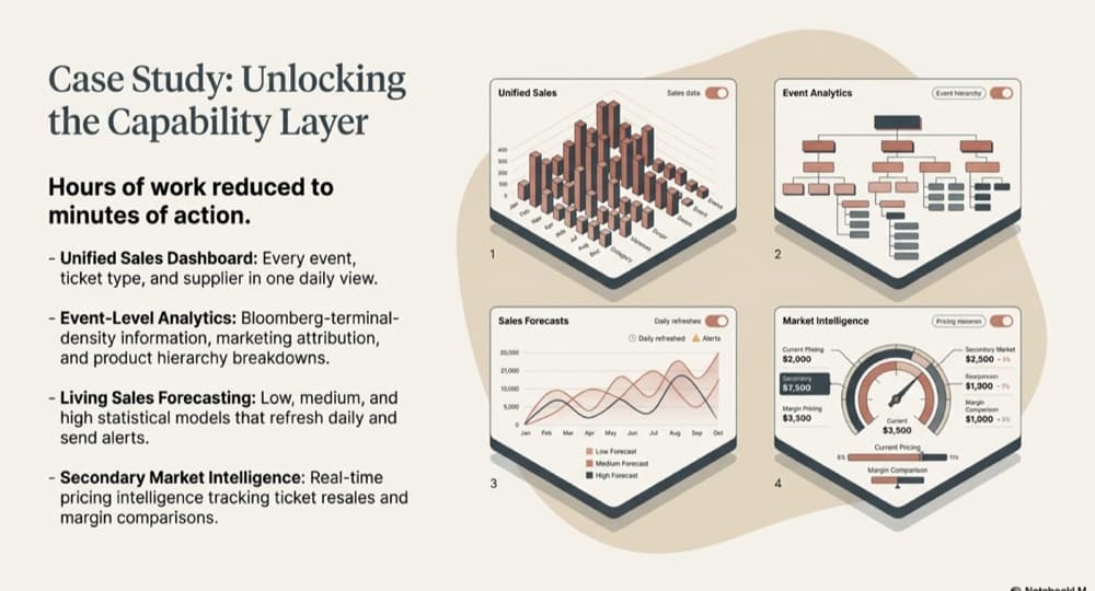
Hours of work reduced to minutes of action.
Every growing business has a version of the same story. Someone — usually someone senior and expensive — spends hours every week pulling CSVs from different systems, copying numbers into a master spreadsheet, manually reconciling figures that never quite match, and producing a report that is already outdated by the time it reaches the leadership team. This is not a minor inefficiency. It is a structural constraint on your ability to make timely, informed decisions.
Why Buying a Dashboard Tool Does Not Solve This
The instinct is to buy a BI tool — Tableau, Power BI, Looker — and connect it to your systems. The problem is that these tools visualise data; they do not fix it. If your underlying data is inconsistent, the dashboards will be inconsistent. If "revenue" means different things in different systems, the dashboard will show you a number that is confidently wrong. The tool is not the bottleneck. The data is.
What the Journey Actually Looks Like
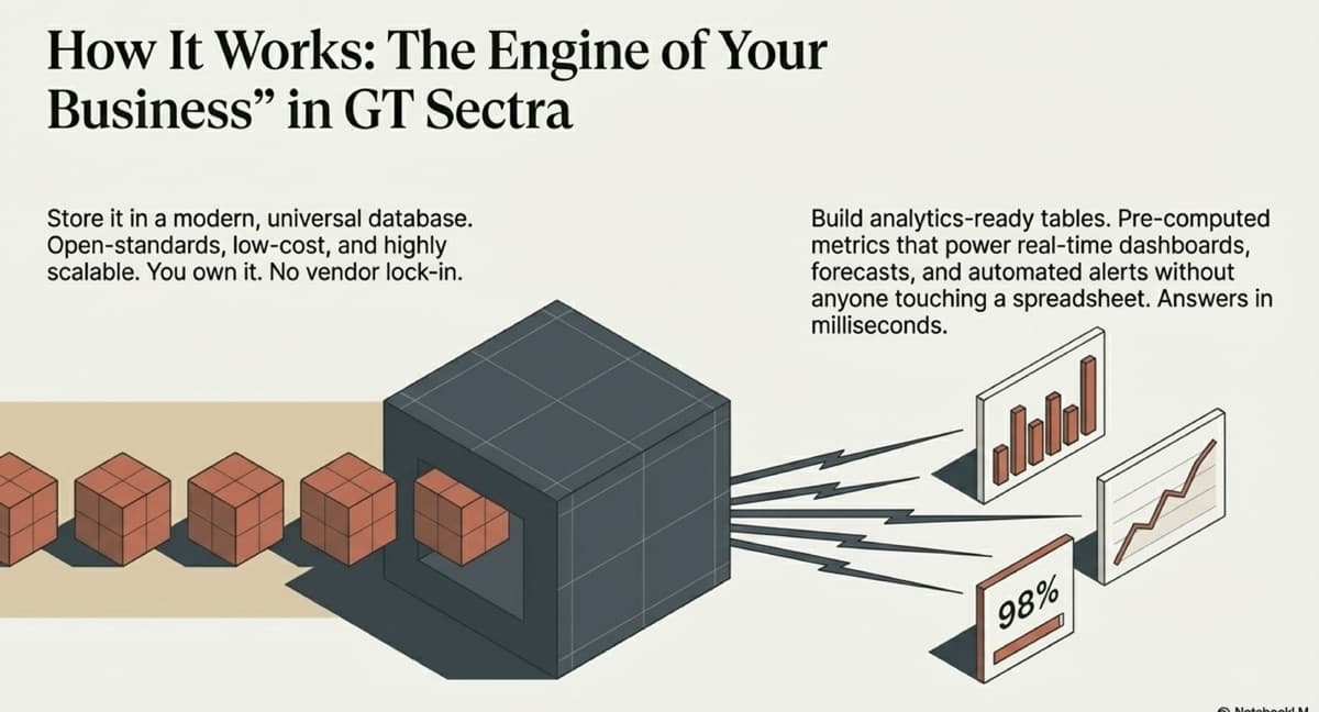
The real path from spreadsheets to real-time dashboards has three steps, and the dashboard is the last one. First, connect your source systems and extract data into a central store. Second, normalise and transform that data into analytics-ready tables — pre-computed metrics with clear definitions. Third, connect your dashboard tool to the clean, structured tables. Each dashboard query hits reliable data. Every number is consistent. Refreshes happen automatically.
Hours of work reduced to minutes of action.
What Real-Time Actually Means
For most growing businesses, "real-time" does not mean sub-second updates. It means: the data refreshes daily (or more frequently for critical metrics), without anyone touching a spreadsheet. It means your leadership team opens a dashboard in the morning and sees yesterday's numbers — accurate, complete, and consistent across every metric. Forrester found that insights-driven businesses grow at an average of 30% annually1. That is transformative compared to the current state of most businesses, where "current numbers" means "whatever was in the spreadsheet someone updated last Thursday."
30%
Annual growth rate for insights-driven businesses
Forrester, 2021
The Capabilities That Follow
Once you have automated, reliable dashboards, new capabilities become trivial to add. Automated alerts when a metric crosses a threshold. Drill-down from summary to detail without building a new report. Forecasting models that layer on top of the same clean data. McKinsey research confirms that data-driven organisations are 23 times more likely to acquire customers2. The first dashboard is not the end goal — it is the beginning of an analytics capability that grows with your business, all powered by the same data foundation.
The ROI
Calculate the cost of your current manual reporting: senior hours per week multiplied by weeks per year. For most businesses, the data foundation and dashboard build pays for itself within the first quarter from time savings alone — before you count the value of faster decisions, better visibility, and reduced risk. The spreadsheet is not free. It just hides its cost in the salary of the person maintaining it.
Sources
- Forrester, "Insights-Driven Businesses Set the Pace for Global Growth" (2021)
- McKinsey Global Institute, "The Age of Analytics" (2020)
Related Capabilities
Business Intelligence & Decision Systems
Executives need clarity, not dashboards for their own sake. We build reporting and decision systems anchored to your commercial priorities — replacing manual processes with real-time intelligence leadership can act on.
Infrastructure & Database Modernisation
Legacy systems and fragmented databases slow everything down. We modernise your data infrastructure — warehousing, pipelines, and platforms — to eliminate silos, reduce cost, and establish the single source of truth your organisation can scale on.
Continue Reading
The Foundation
Single Source of Truth, Explained
What a single source of truth actually means for a growing business, how to build one, and why it eliminates the reconciliation headaches that cost you hours every week.
Read →The Problem
What Messy Data Actually Costs Your Business
Messy data creates slow decisions, wasted hours, invisible risk, and missed opportunities. Learn the real cost of scattered, inconsistent data across your business systems.
Read →The Transformation
How to Connect Disconnected Business Systems
A practical guide to getting data out of silos and into a single place. The unglamorous, complex, but essential work that makes everything else possible.
Read →Ready to build your data foundation?
Let's have a conversation about where you are and whether data foundations are the right investment right now.
Start a Conversation